How Colour Defines Heat Perception Across the Arabian Peninsula
By Mark Woodward
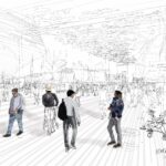
It is that time of year when temperatures soar in the Middle East, and as I try to extend my outdoor activities beyond early mornings, I think about the potential impact of colours in our surroundings on cooling public spaces.
Recently revisiting my early work on colour theory, I explore its application in our cities, particularly in climates where heat is persistent. Can our perception of temperature be swayed by how we apply colour around us?
This is the premise of the Hue-Heat Hypothesis (HHH), a fascinating nexus of psychology, physics, and design, suggesting that our environment’s palette can subtly influence how warm or cool we feel. Now, I’m not suggesting that we recolour entire public realms that compete with cultural aesthetics but I am interested in the rich, Middle Eastern cultural colours used indoors and out, and how they can be applied alongside the HHH.
The HHH approach is simple: warm colours like reds and oranges evoke warmth, while cool blues and greens suggest coolness. This is a concept with nearly a century of scientific inquiry behind it. Our brains are wired to associate red with fire and sun, and blue with water and sky. This cross-modal sensory interplay means that the dominant wavelengths of light reaching our eyes can genuinely alter our perceived temperature, regardless of the actual reading on the thermometer.
This psychological phenomenon, not a physical temperature shift, was demonstrated in the 1970s by Povl Ole Fanger – a pioneering figure in environmental psychology, who discovered some fascinating insights into human comfort. One of his more notable experiments involved participants placed in rooms illuminated with red light. Fanger observed that individuals in these red-lit rooms tended to prefer lower thermostat settings compared to those in differently illuminated environments. This finding challenged conventional wisdom at the time, suggesting that ambient colour temperature could play a significant role in how people perceive and adjust to indoor temperature settings.
Fanger’s experiments were groundbreaking because they underscored the complex interactions between environmental factors and human comfort. His work highlighted that comfort in indoor spaces isn’t solely determined by physical parameters like temperature but also by psychological and sensory influences. By manipulating lighting conditions, Fanger demonstrated that subtle changes in colour temperature could impact perceived warmth or coolness, influencing individuals’ thermal comfort preferences and their behaviour. The implication that colour influences thermal sensation is particularly compelling for regions in the Middle East, where thermal comfort is a critical aspect of daily life and architectural design.
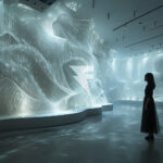
Illustration: © 2025 Mark Woodward
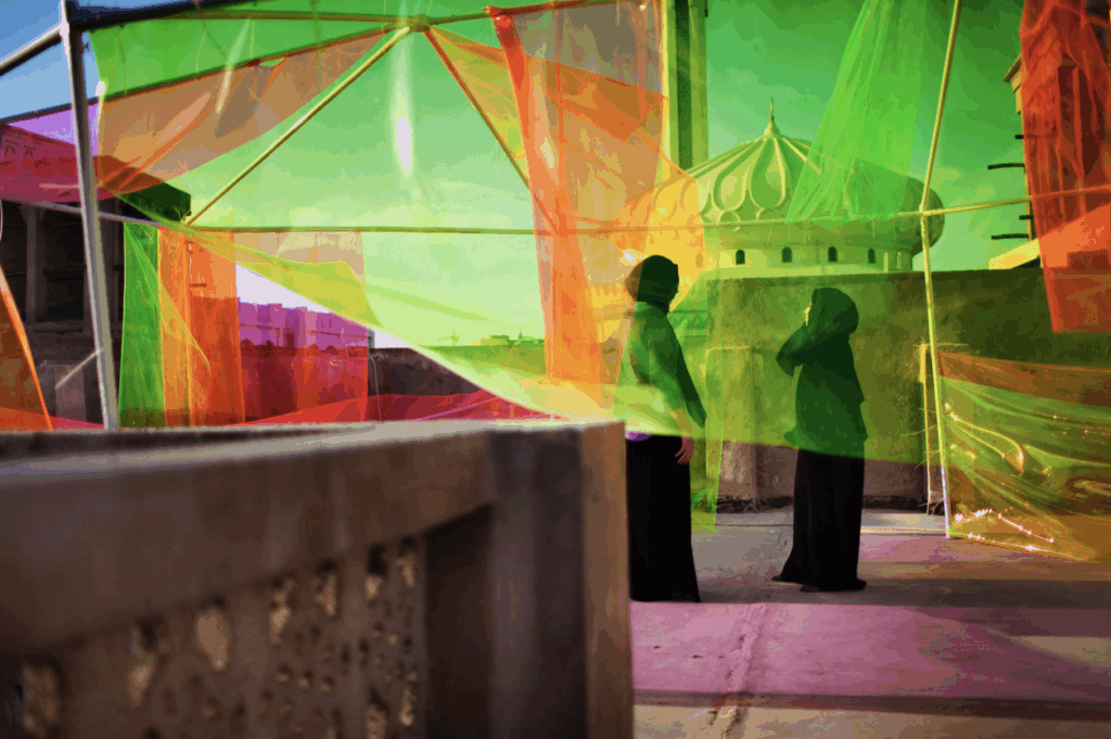
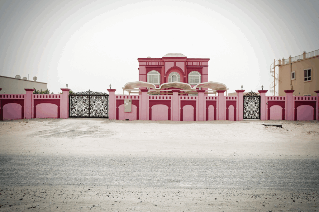
Historically, Arabian Peninsula architecture intuitively incorporated HHH principles. The whitewashed walls of traditional Gulf homes, reflect solar radiation and psychologically contribute to a sense of airiness. Shaded courtyards in historic structures often feature cool blues in their tile-work, refreshing greens in gardens, and the soothing presence of water. These elements are not just aesthetic; they create microclimates offering both physical and perceptual relief from the pervasive heat, a thermal design language refined over centuries.
In today’s Arabia, futuristic metropolises like Dubai and Riyadh, HHH finds new relevance. As energy consciousness grows, influencing perceived temperature through colour offers a tantalising, low-impact solution. Imagine smart buildings subtly shifting LED lighting hues: cooler blues during peak heat, transitioning to warmer tones as evening approaches. This technology is available; the challenge is in how it is applied within the unique geographic context – the constant sunlight, often filtered through dust, creates a warm ambient baseline. This suggests that achieving a noticeable cooling effect might require more deliberate or contrasting use of cool colours than in temperate climates. An overabundance of warm tones could be counterproductive.
However, the science has its complexities. Research indicates the HHH effect is most pronounced in moderate conditions, potentially diminishing at extreme temperatures. If you’re already enduring 45°C with humidity thrown in, a blue wall offers limited solace. Adaptation also plays a part; constant exposure to warm desert hues might desensitise inhabitants. Thus, a shift to cooler indoor tones could be more impactful, offering a welcome contrast. Interestingly, studies suggest cool-coloured light is more reliably perceived as cooling than warm light is as warming, perhaps because extreme heat overrides subtle visual cues, while the chill of aggressive air conditioning is already a strong sensation.
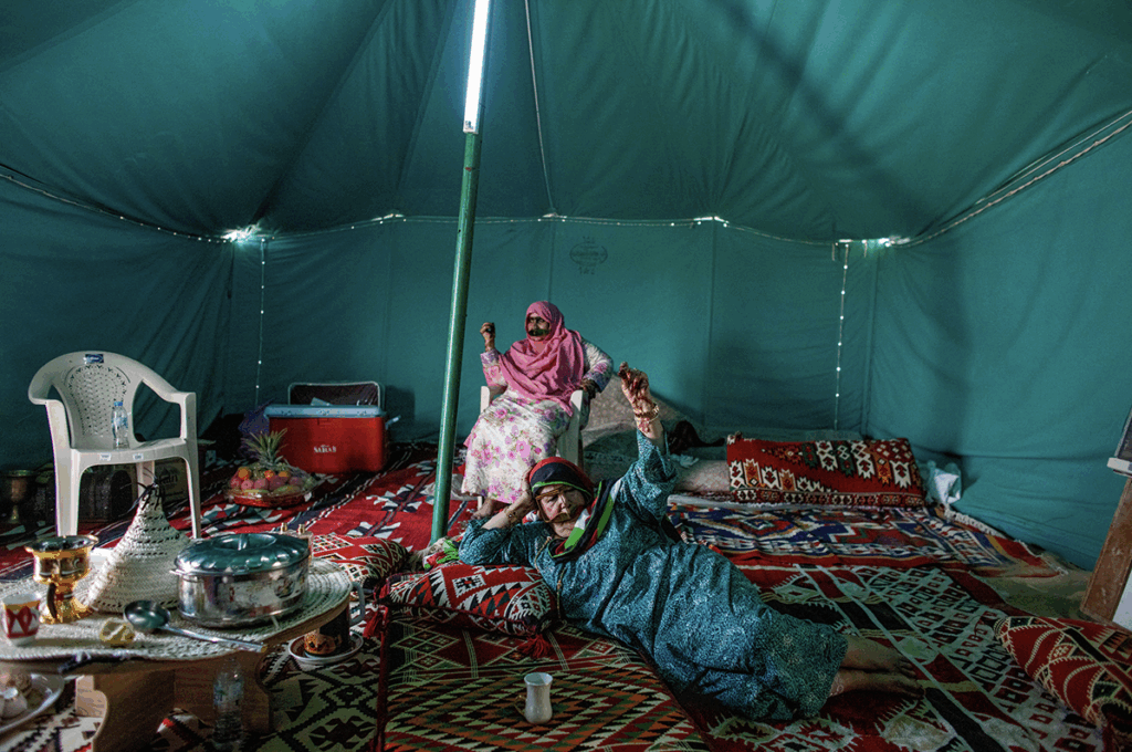
The cultural dimension is also crucial. While the red-warm, blue-cool association is largely universal, local colour preferences and symbolism vary. Design choices must respect these nuances. The indoors can be starkly different from the neutral building facades, revealing, highly decorative and colourful interiors. How can cultural designs be strategically enhanced with cool accents to improve thermal comfort within public buildings and commercial spaces without aesthetic compromise, and what can be reintroduced into the public realm?
Ultimately, the Hue-Heat Hypothesis presents a compelling, energy-efficient strategy to augment traditional and modern climate control in the Middle East. It reminds us that our experience of the world is a rich, multi-sensory tapestry. By understanding and harnessing colour’s subtle power, architects and designers can create environments and atmospheres that are more psychologically attuned to the unique character and cultures of the Arabian Peninsula. As these nations build for the future, this blend of ancient wisdom and modern science offers an invaluable tool for crafting truly livable spaces.
At Busa Woodward we care deeply about the cultural nuances of colour and pattern which can be seen in our projects throughout the Middle East. We are happy to chat or go for a coffee to discuss more about colour in your projects, or email us: hello@busawoodward.com
Discover meaningful, dynamic colour experiences that engage, surprise, and connect at www.busawoodward.com