Design for Cognitive Clarity
By Federica Busa & Mark Woodward
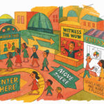
Signage and wayfinding are often bundled together as if they were interchangeable. But while they are related, they should not be conflated: signage is a tool; wayfinding is multiple systems.
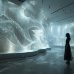
Effective wayfinding begins long before any signs are printed or installed: it starts with the intuitive layout of space, the rhythm of architecture, the legibility of paths, and the sensory cues embedded in landscape, sound, texture, and light.
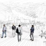
Designing for cognitive clarity means shaping environments that align with how the human brain actually makes sense of space. In complex places—parks, campuses, airports, cultural districts, mega-destinations and events—confusion is more than an inconvenience. It’s a cognitive tax.
The human brain builds mental “maps” to navigate space, but when visual logic breaks down, when signs contradict, pathways twist without purpose, or the environment offers no cues, we disconnect. We disengage.
Too often, wayfinding is treated as an afterthought – a set of signs installed once the concrete is poured. But clarity doesn’t begin with signage. It begins with designing environments that think like humans do.
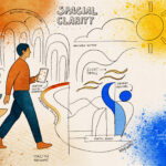
We believe spatial clarity is a form of storytelling. A good environment answers three questions without a single word:
Where am I now? What’s around me? What can I do next?
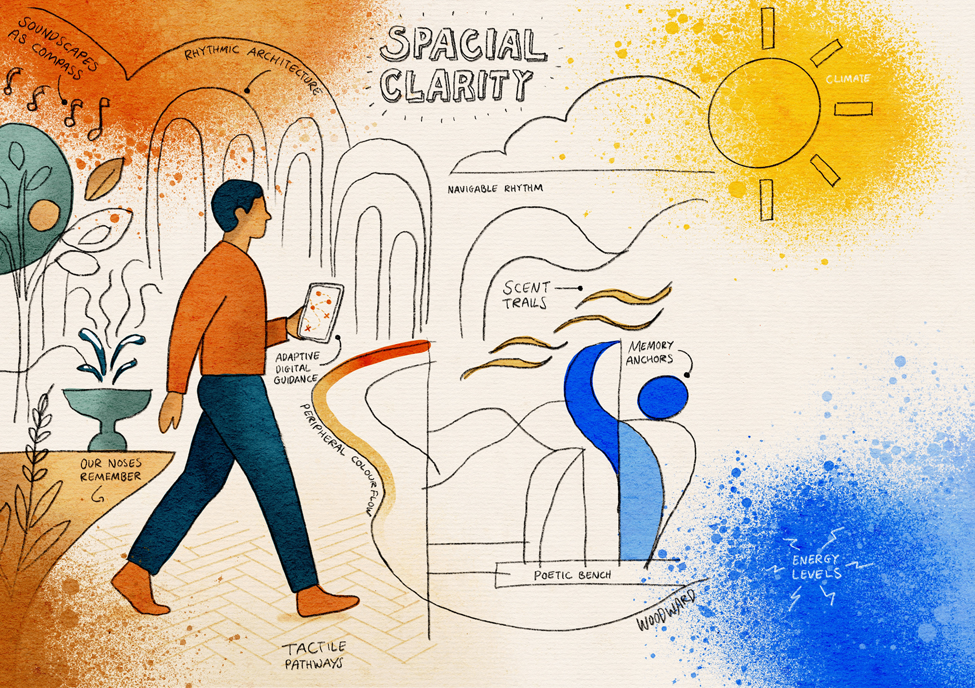
To achieve this, we look beyond signs and tap into the deeper systems of human perception:
Rhythmic Architecture
Repetition calms the brain. A steady sequence of trees, arches, or columns creates navigable rhythm and pattern recognition.
Soundscapes as Compass
Discreet audio cues like trickling water or spatial audio guide movement without ever demanding attention.
Scent Trails
Lavender at rest zones. Citrus near active plazas. Our noses remember locations long before our brains do.
Tactile Pathways
Floor textures that shift underfoot signal changes in purpose: rough to calm down, soft to pause, smooth to keep moving.
Peripheral Colour Flow
Warm tones to energise. Cool hues to soothe. Colour changes not as branding, but as emotional orientation.
Memory Anchors
A poetic bench. A whispering wall. A kinetic sculpture. Small moments that become memorable coordinates in our mental map.
Adaptive Digital Guidance
When needed, tech steps in: real-time, personalised directions based on comfort, weather, or energy levels.
Naming
People remember stories, not signs. Places with meaningful, story-rich names create powerful orientation anchors in memory.
With this approach, visitors don’t just move through space. They understand it. They feel it. They trust it.
In an age where cities are becoming experiential ecosystems, cognitive clarity is the defining element. It’s how we show care. It’s how we earn attention. And most importantly, it’s how we ensure visitors feel not just informed, but instinctively at home.
Let’s design for the brain, not just the eye. www.busawoodward.com
Learn how spacial clarity can help your project. Let’s chat or drop us an email at hello@busawoodward.com
#VisitorExperience #Wayfinding #UrbanDesign #CognitiveDesign #ExperienceStrategy #Neuroarchitecture #Placemaking #BusaWoodward